UNOS
Web design
A journal of things learned and designed while serving as a primary caretaker for content-heavy website.
During my years as a ux / web designer, I continously worked to care for and curate the experience of the diverse groups of people visiting the site.
The site needed to support the needs for both the technical medical professionals and their patients and family members. We also needed to consider the media, the general public, and policy makers.
Back to basics: rethinking the homepage
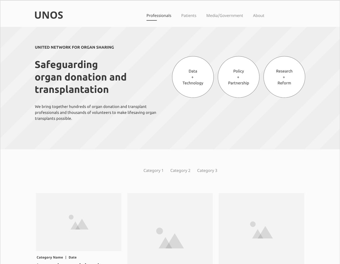
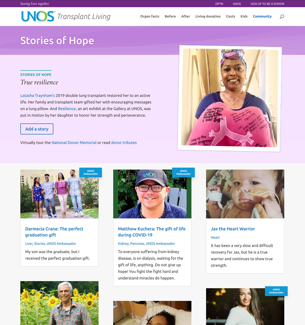
Before the redesign
Feeling lost
Site visitors reported problems locating what they hoped to find.
Conducting user interviews and usability sessions, we discovered multiple issues to address.
A lengthy homepage packed with technical, scientific news articles, while needed by transplant professionals, confused or frustrated the many patients and general public visitors.
The navigation, which was heavily used by site visitors, didn't have groupings that made sense to all audiences.
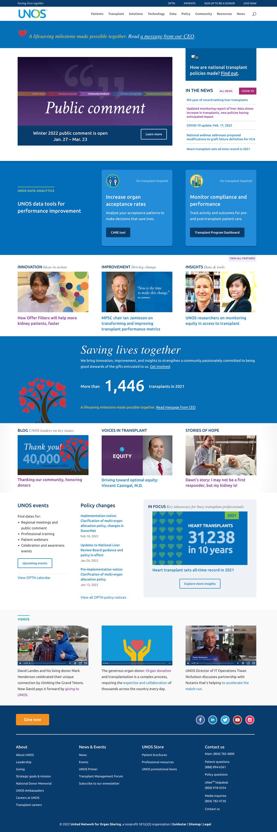
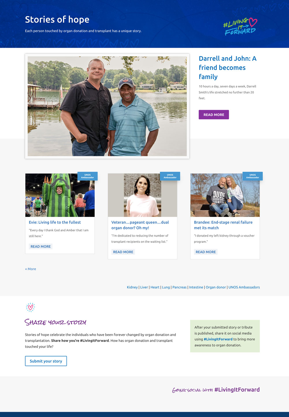
After the redesign
Welcoming and helpful
The navigation reflects the key audience segments and offers direct links to the content they seek.
Key messages about the non-profit's purpose and aims are featured to grow understanding across audiences.
Based on both analytics and usability sessions, I shortened the homepage length and helped develop guidance on where to promote content.
Those needed technical, scientific news items moved to a redesigned news section specifically for donation and transplant professionals.
Telling stories
One million reasons
To celebrate surpassing one million organ transplants, I designed an immersive campaign website for UNOS' Living it Forward campaign.
The campaign would encourage people to share their stories, so I was also tasked with redesigning the story landing page and story templates to match the campaign styles.
Before the redesign
After the redesign
A feature story layout
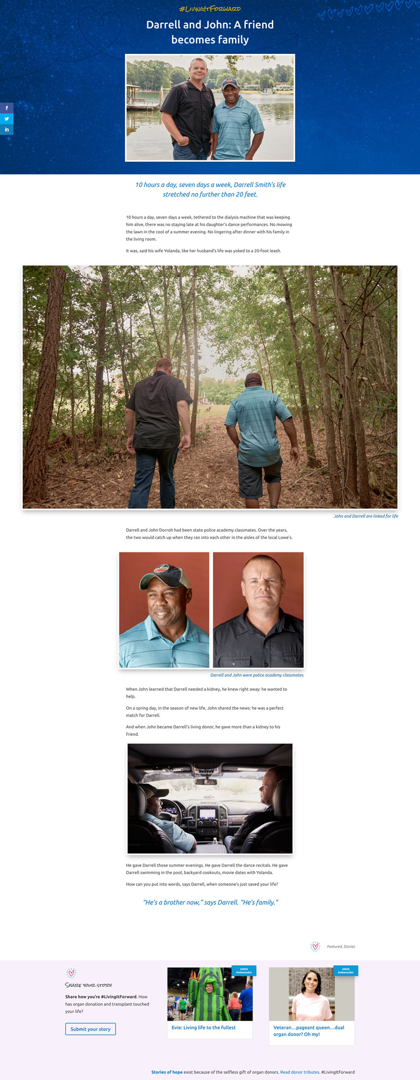
Make it functional
With the redesign, my aim was to craft an elegant template that both encouraged reading and was efficient for the person publishing the stories.
Another key aim was to enable more efficient promotion of annual awareness events within stories. I designed modules tied to categories that could easily be updated and turned on and off.
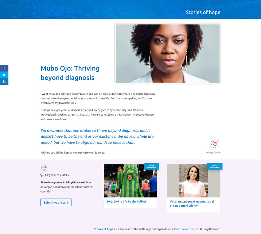
A standard story layout