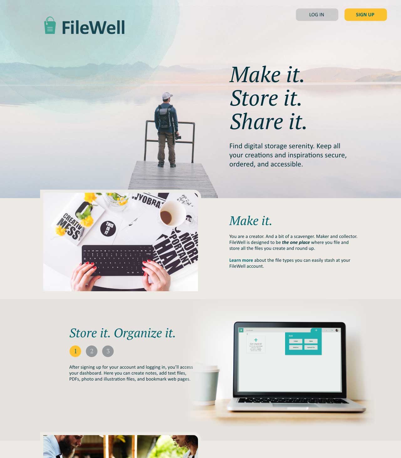
Filewell
A solution for digital hoarding
Many of us keep too many browser tabs open and stash files and bookmarks across folders and services—which can add up to cluttered mental space, wasted time, and lost resources. FileWell—an online storage site—was a conceptual project aimed at solving this problem by bringing order to digital file storage. After all, it’s only called hoarding if you don’t have enough space and organization for your stuff.
01 The challenge
Talking with people about their digital storage habits, I found that some individuals were using up to 8 different tools or services to preserve files, which later led to frustration over lost files and time.
FileWell, a cloud storage solution, was created to help people organize and curate collections of files in one location for easy retrieval and collaboration. And since good organization depends on user practices, the product was built with both an immediate and long-range aim of encouraging and teaching users file management best practices.
FileWell was a conceptual project with mentor oversight that allowed me to gain agility with new tools while also refining my established design process to tackle the extra dimensions of human interaction with a web and mobile product.
02 The process
Question. Talk with people and analyze the market.
The aim of this educational project was to learn by doing. My work began with a broad directive: a fictional client wanted to enter the cloud storage and organizational market, encouraged exploration, and set few constraints. I began by researching cloud storage trends and existing products (Google Drive, Dropbox, Evernote, and Dropmark). SWOT analysis and mapping user flows for existing products allowed me to understand existing products and the tools that users might currently use.
Next up, I asked questions. For this project, potential users completed an online survey. I recognize that surveys are not always the best way to collect reliable information, but I shaped the questions with the aim of unearthing themes and user motivations.
Build and test. Set up guideposts for the journey.
The initial survey results, combined with follow-up discussions with respondents who provided email addresses, allowed me to create two user personas to remember the frustrations and goals of potential users. I wrote user stories to define the scope of the MVP and drafted user flows to map out process and determine product architecture.
Survey findings were translated into user personas to embody the two main categories of users—creators and curators—who served as guides for the MVP based on the user stories.
Initial sketches quickly converted into a low-fidelity wireframe prototype to conduct in-person usability tests.


1

Original design

After: Adding pane repositioned as a drop-down menu from toolbar better connected the process for users, especially when the dashboard was populated.
2

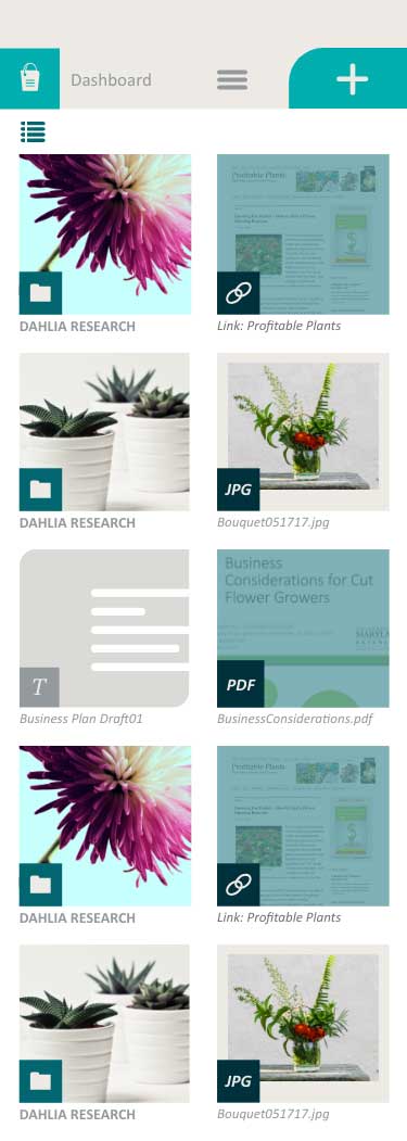
Original design: populated dashboard

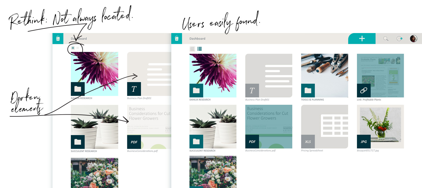
After testing: Added ability for the user to change the dashboard view from thumbnail to list view.
3

Refining and building on a tested foundation.
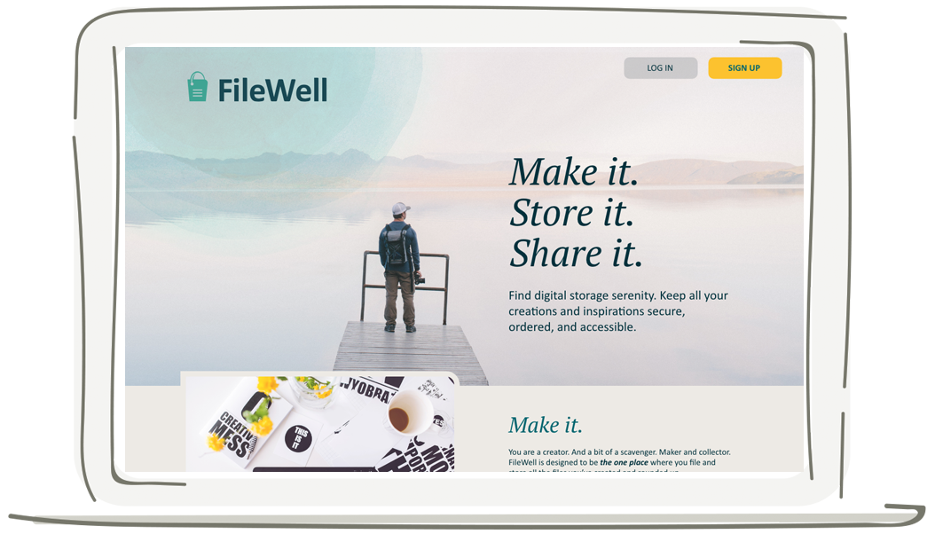
Using user-expressed needs collected during research to make a mind map, I found my way to the product name FileWell—capturing both the product's core idea of a healthy file storage system and its result, a deep reservoir of digital files for future inspiration and work.
Wanting the text and imagery to align with the product’s ease of use, I tailored the voice and messaging to be to the point and helpful—with occasional playful nods toward the deep waters of a well. And I selected photographs and colors to communicate calm and peacefulness.
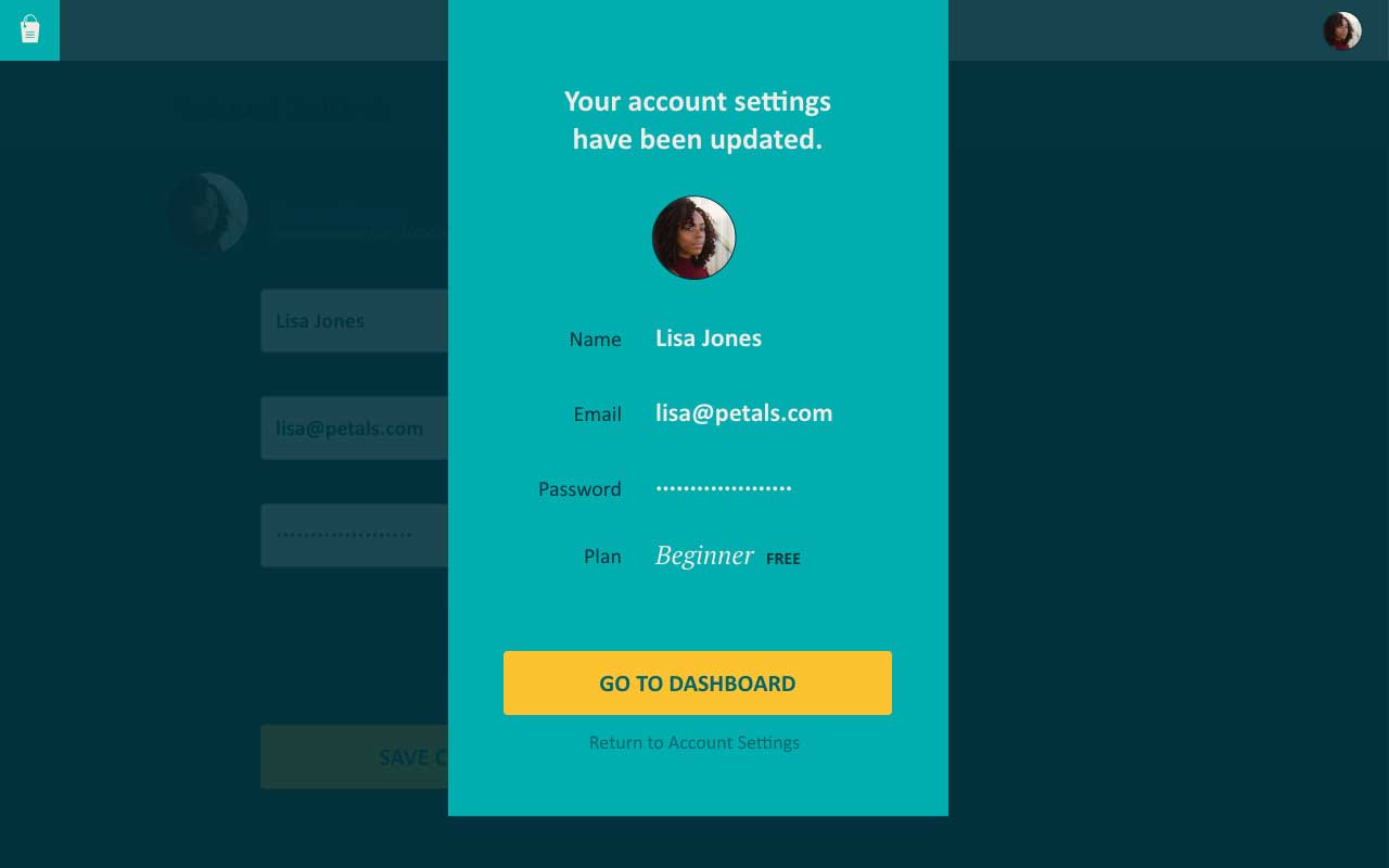
I created a style guide to document and ensure branding consistency. And I took the wireframes from low- to high-fidelity.

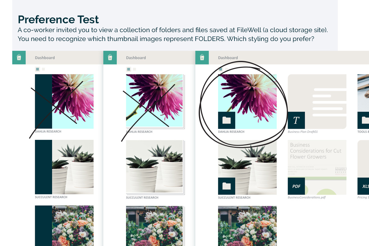
Branding decisions made, I created a high-fidelity prototype, using preference tests to determine the most recognizable mark to identify file types on the dashboard.
In another round of usability testing, I asked participants to complete four tasks, recording the in-person and remote sessions. I made changes to the high-fidelity prototype based on the user reactions and feedback during testing sessions.
1 I sought feedback by way of preference testing to uncover the best solution for users to easily recognize file type icons and buttons.
2 During usability testing, I quickly discovered that the icons allowing users to switch between thumbnail and list view were too small. I increased size before more testing.
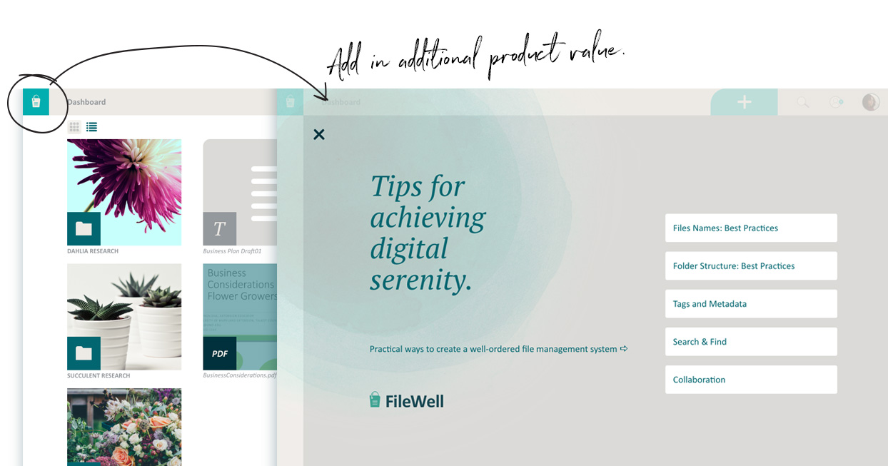
3 As I’ve learned from initial research and personal experience, learning and employing file management best practices is key for any user to find ‘digital serenity.” A key distinctive for this product would be a library and tips to educate and encourage users to use best practices. This library, along with tips baked into the workflow, would grow with the product. And more functionality could be unlocked as a user upgrades her plan.
To conclude work on this project, I packaged up deliverables with the understanding that this would be the first cycle if this were a product moving on to MVP development.
03 What I learned
Question. Build. Test. Repeat. And never stop learning.
Having worked as a visual designer for 20+ years, I have a solid design process that guides my work from idea to completion—on time and on budget. The aim of this project was to gain agility with new tools and expand my process for the extra dimensions of human interaction involved in web and mobile products.
The usability testing sessions taught me the importance of allowing users the time to struggle in order to appreciate the roadblocks or flaws that need to be addressed in product design.
Working frequently as a freelance designer, I often detect and alert clients to confusing text or processes. But, on this project, I was confronted with the reality that this ability does not directly translate into knowing what will be intuitive to a user inside all the moving parts of a website or mobile app. Intuitive can be a moving target.
And I found that the user experience design process pulls together my strengths and interests: conversations built around questions and listening that guides refinement for an elegant, functional product.