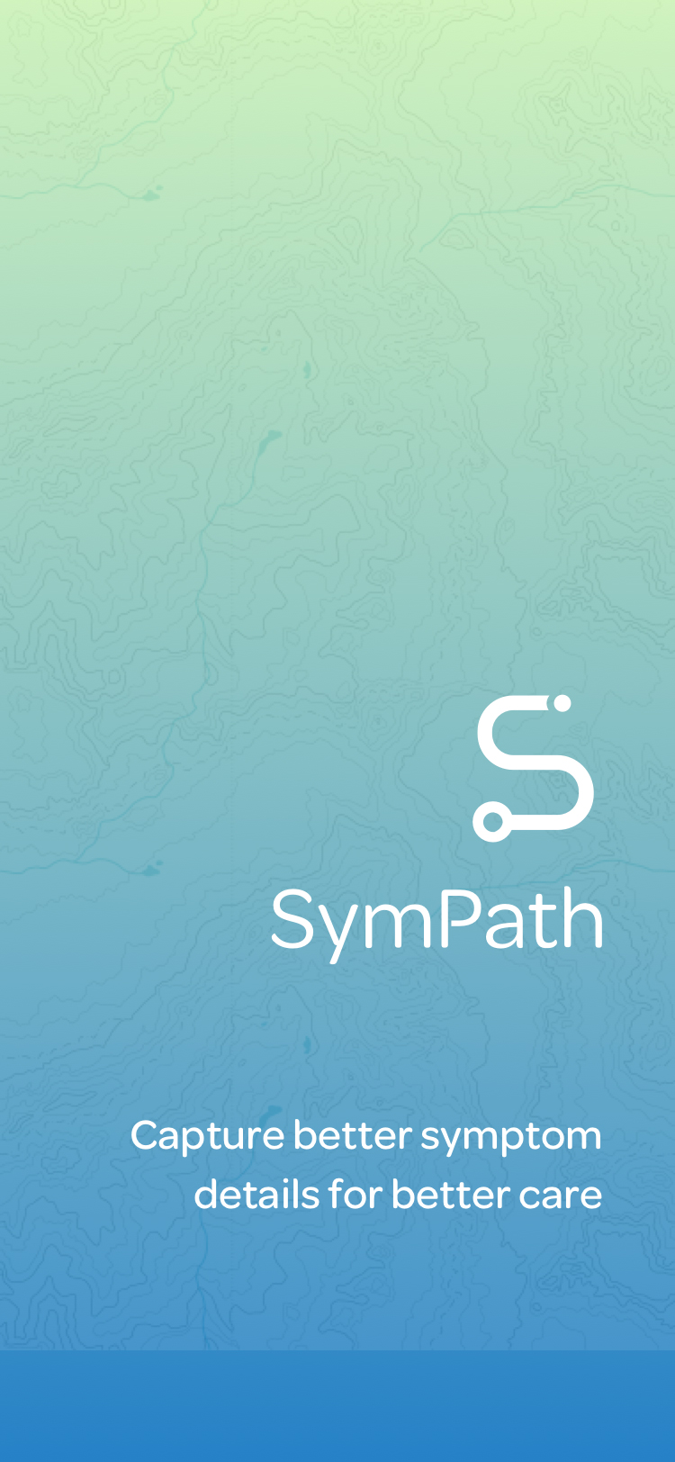
SymPath
Building a solid product path
Changes in health can be disorienting. SymPath empowers people to easily keep record of the symptom details that healthcare providers will want to know. This case study focuses on the testing and refining design that paved a solid product path.
01 The problem
Acting as a caregiver for several people, I wished I had a more efficient tool to track symptom details so I could better communicate with healthcare professionals during the brief face-to-face appointments.
02 The solution
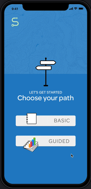
SymPath, an iOS app, empowers the user to record symptom details that are important to healthcare providers. Based on insight derived from user research, the app allows the user to choose between two paths so she can customize her experience and determine the type of detail she wants to collect.
03 The process
Research to determine need and value
I had a need. And having spent more than 300 hours assisting in hospitals as a nursing student, I felt I had insight to build a useful tool. I knew the assessment questions that healthcare professionals ask to collect the data needed to make diagnoses and care plans.
So, my challenges were:
- to find out if other people had a need for such an app, and if so,
- to build a tool that empowered users to record meaningful data, allowing them to be engaged participants in their own health care.
Uncover user needs: I asked people if they ever tracked symptoms (75% did) and how they did it (57% claimed to remember details unaided).
I was envious of their abilities. I could never seem to remember how many weeks it had been since that tumble that caused a fracture, or the names of the last three specialists we had seen and the different tests ordered.
But, a follow-up question revealed some cracks. When asked what details were harder to remember, 57% fessed up to struggling to remember specific dates and duration of symptoms. 52% admitted they forgot the questions they intended to ask the doctor. And 43% struggled to describe how their symptoms had changed over time.
Market research to guide product design: To understand the competition, I downloaded symptom-tracking and notepad apps. I found existing apps were designed around either one specific symptom (pain) or a specific cluster of medical conditions (such as digestive problems). There appeared to be a gap in the market for an app allowing the user to customize their symptom tracking, so this is where I started to build.

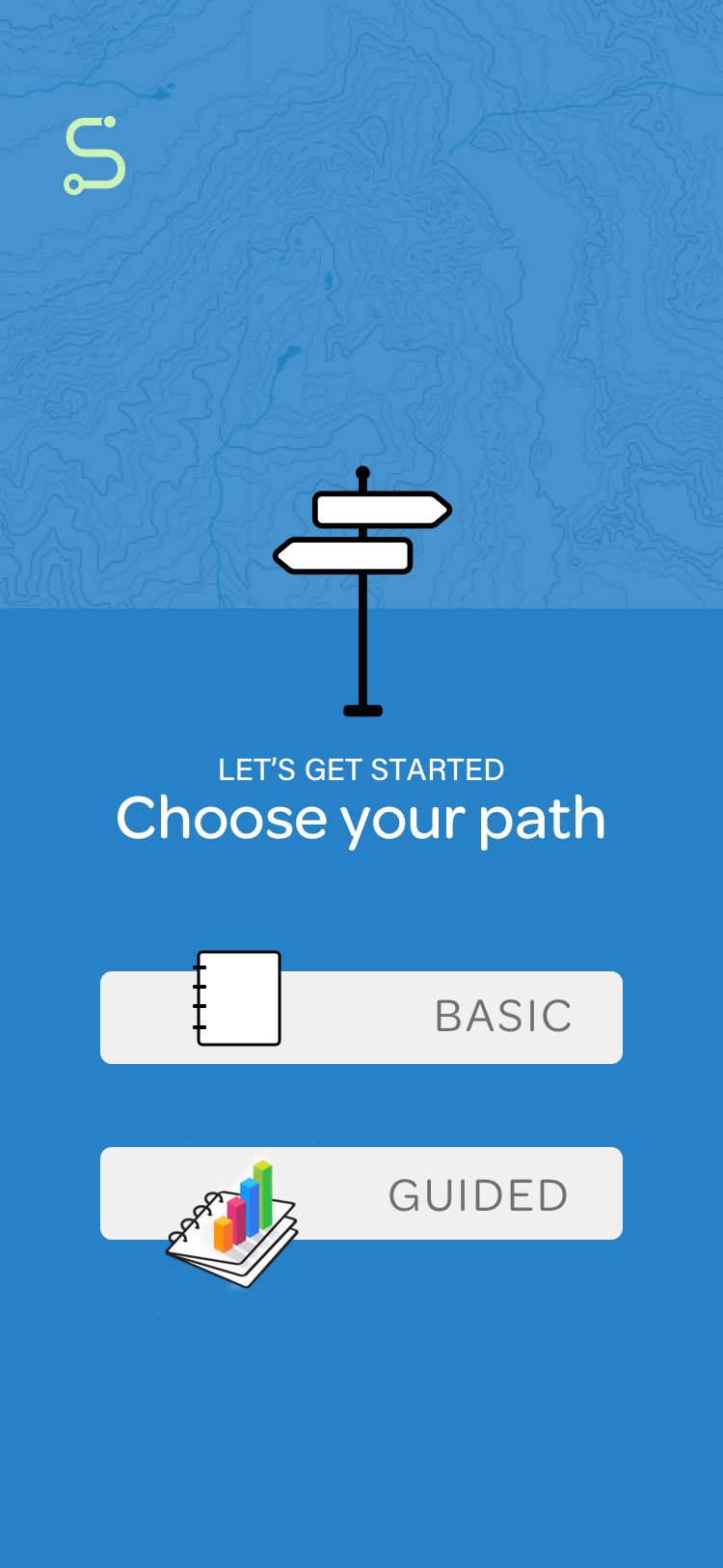
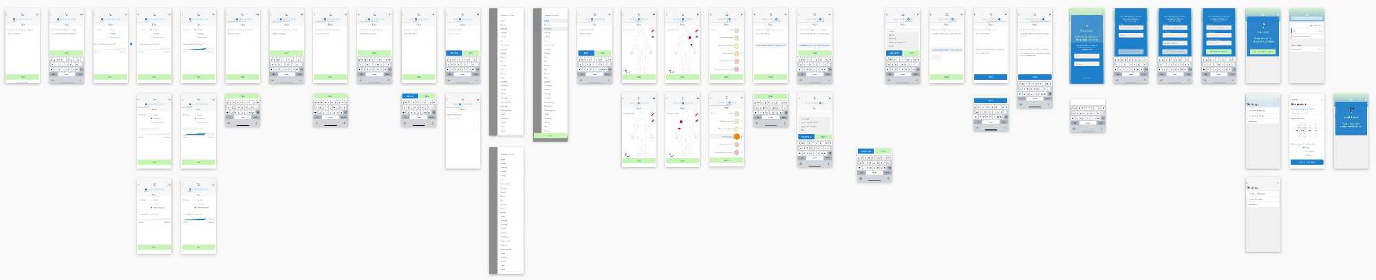
Wayfinding: creating, testing, and refining 2 paths
Research directed us to personify 2 main types of users: an occasional and a frequent user based on her health concerns. User stories based on user research, paved the way to an app offering 2 pathways: basic and guided.
View
Ellen an occasional user
Motivation: She likes to discuss health issues with doctor with details and facts. She would record occasional flare-ups or changes so that she can remember dates and contributing factors.
Frustrations: Not remembering dates or details. Not remembering suggetions made by doctor.
Vicki a frequent user
Motivation: She's been suffering from chronic, ongoing issues which have led to hospital stays, specialists, medications, and tests. She wants a better system for keeping records.
Frustrations: Not knowing what details are valuable to record and not knowing how to describe what I'm feeling. Not remembering questions I wanted to ask doctor.
Here, we're taking a slight detour to discuss the visual design decisions before refocusing on the successive usability tests that guided product refinement as we moved the prototype from low-fidelity to high-fidelity. Visual design decisions were made concurrently and implemented during the same timeframe we were conducting usability tests.
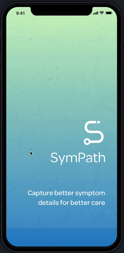
Visual Design: wilderness navigation as a guiding metaphor
Knowing that illness can make a person feel lost in the woods, I found wilderness navigation, or orienteering, a helpful guiding metaphor during product development. So, when it came time to name the app and give it a visual identity, I kept heading in the same direction.

Trying to communicate the uniqueness of a person’s experience of symptoms, I explored the similarities between a fingerprint and a topographic map. And, I sketched and tested other navigational symbols such as maps and compasses.

In the end, the blending of a stethoscope-like shape with an orienteering path symbol to make an "S" ultimately performed best during preference testing as it reinforced both the product name and purpose.

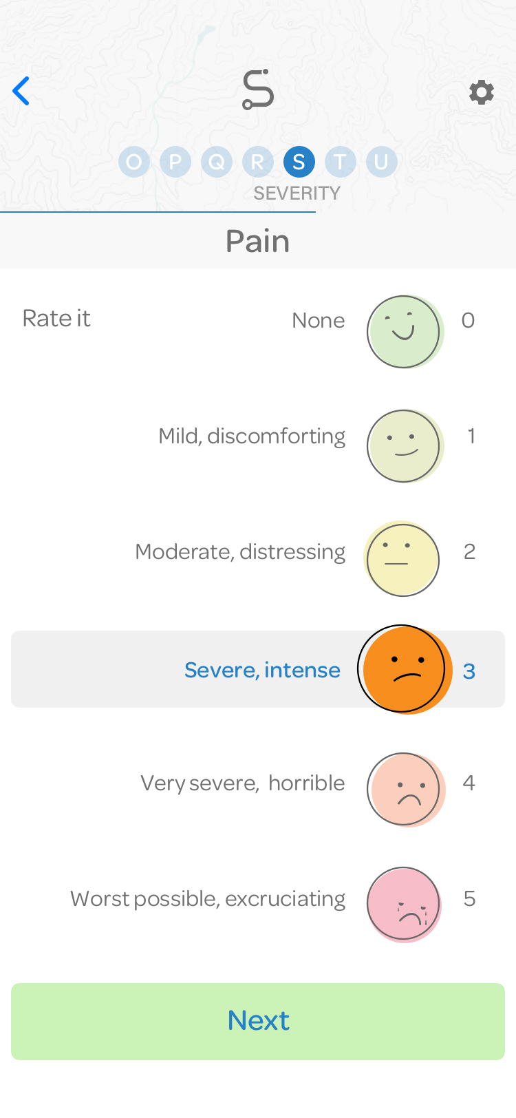
Other visual design decisions included creating friendly, understandable icons to assist with data collection on assessment screens, such as creating faces for the pain scale, based on accepted Wong-Baker FACES scale.
Now, we turn back to the refinement of the app's guided path, tracing the top 3 issues uncovered and addressed during the successive usability testing sessions.
Usability testing: finding and removing roadblocks on path 2
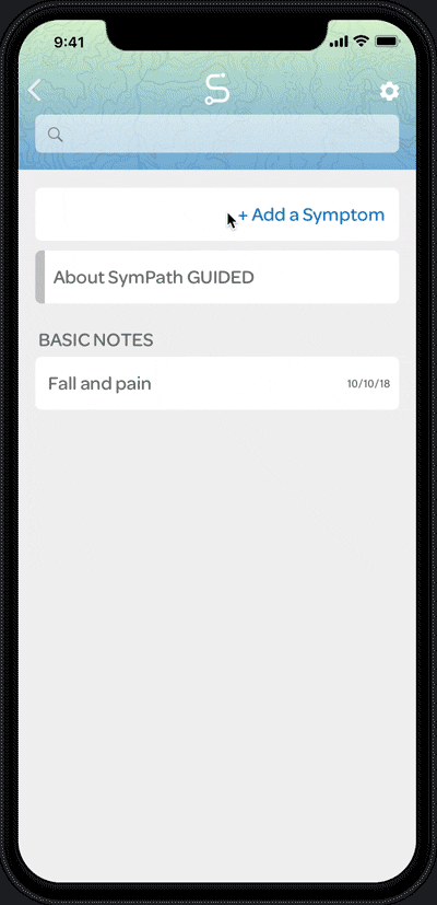
The design for the basic path, a simple notepad, was fairly smooth and performed well in usability testing.
User testing for path 2, the guided path, would reveal multiple times, that I needed to re-route the product design. Following, are the roadblocks we encountered during successive rounds of usability testing as we moved from the low-fidelity to high-fidelity prototypes.
Roadblock 1 Too many options, too soon
Early product design—tested during low-fidelity prototype phase—expected users to understand a lot of information in order to customize the assessment, encouraging them to do this before having really used the product. This design proved doubly flawed as the assessment question relevance can change based on symptom selection.
Revised design: Instead of asking user to understand terms and customize their experience, users are guided through all assessment pieces with a Next button allowing users to easily bypass screens. And for the curious, the explanations are inside the About section.

Roadblock 2 Path gets too steep
Initial product design guided users to create daily journal entries populated with as many symptoms as they wished to track. During usability testing of both the low-fidelity and more refined high-fidelity prototypes, testers played right along, but additional usability testing revealed that this would lead to muddled data as assessment notes were not focused.
Revised design: Instead of creating a journal entry for the day covering all symptoms, users now create separate symptom notes. Narrowing the scope of an entry enables better data collection and keeps assessment questions focused.
Roadblock 3 Trailhead needs improvement
AKA, Onboarding. During each usability testing session, I also assessed the effectiveness of the onboarding screens to educate the user on the difference between the 2 paths. I trimmed and rewrote the text to be as direct as possible. I created icons to illustrate the added dimensions offered in the guided path, and finally, found the added animated screens most successful.


04 What I learned
Get to the point. Hitting the right amount of detail on onboarding screens takes work. During usability testing, I repeatedly observed testers resist reading even brief text that would help them better understand the product. To make onboarding as successful as possible, I wrote and re-wrote the introductory text and added icons to help communicate the difference between the 2 paths. In the end, animating some app screens combined with the refined, brief text, proved most successful in shaping a user’s understanding of the 2 pathways.
Ask questions that reveal reality. In talking with people during the initial survey and later usability testing, I aimed to ask questions that enabled me to understand their life as they experienced it. I wanted to learn about their actions and their habits, rather than their opinions. I found “The Mom Test: How to talk to customers and learn if your business is a good idea when everyone is lying to you” by Rob Fitzpatrick an excellent guide.
Usability testing pays off. Nothing beats a user reaction to confirm that the work was worth it. "I would have loved to have had something like this after my car accident. I tried to write everything down but it got hard after a while to remember and document everything."